How illustrated maps help tourism boards inspire visitors, and what goes into creating a great one
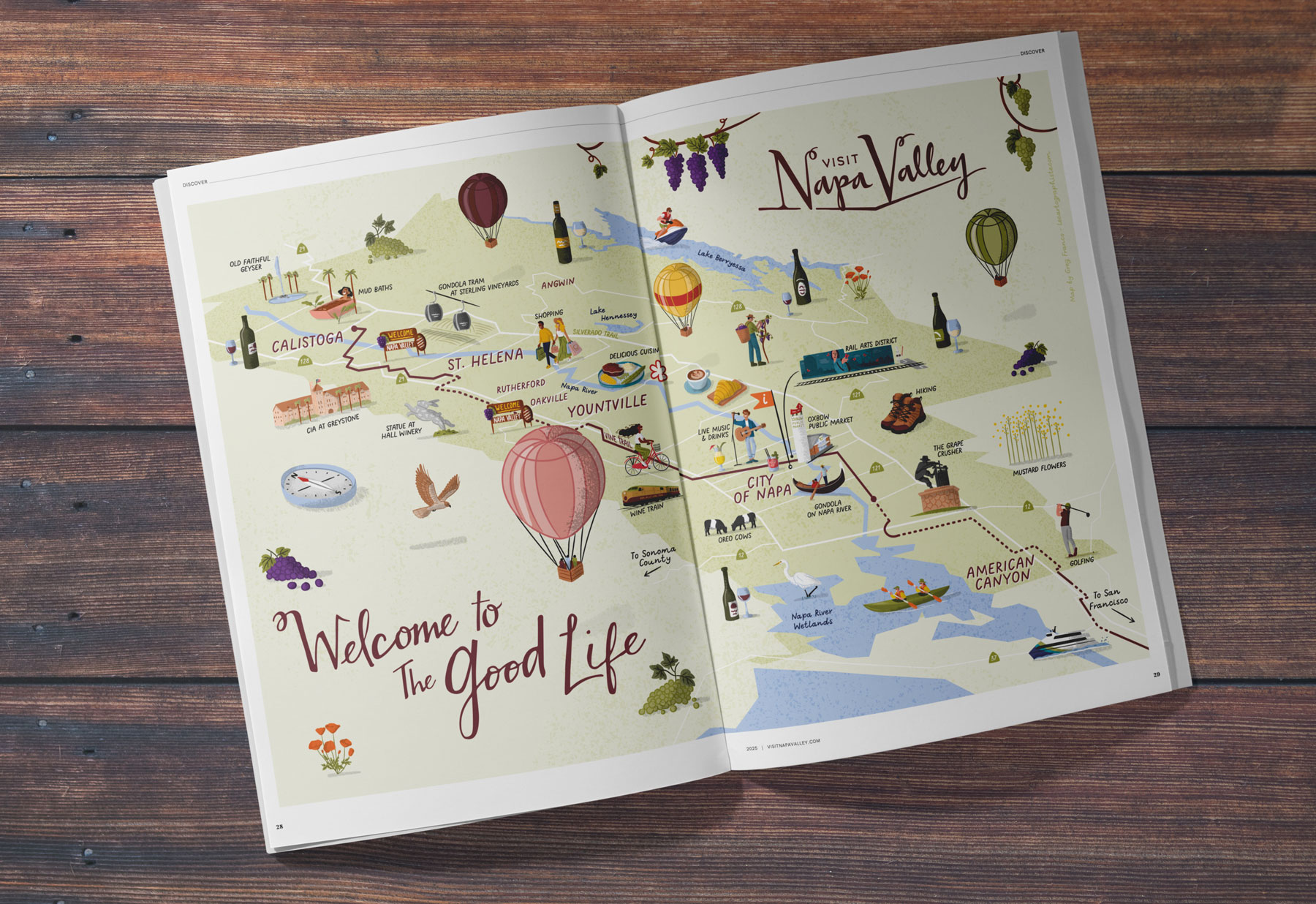
As a freelance illustrator, over the past few years, I’ve seen tourism boards, DMOs, CVBs and marketing agencies increasingly turn to illustrated tourist maps. Destinations want to stand out, and maps have become an essential part of their storytelling, visitor guides, websites and seasonal campaigns.
Whether it’s an urban center, an outdoor region, a scenic trail or a small town, tourism professionals are looking for ways to stand out and tell a richer story. And one thing is clear: illustrated maps are no longer only navigation tools. They’ve become visitor experience tools.
To show how destinations use these maps, I’ll share an example from one of my collaborations with Visit Napa Valley and how they used a coordinated series of custom maps to connect with visitors and promote the region’s identity. But first, let’s talk about what sets the foundation for any successful map.
If you’re new to illustrated and practical maps, you can also read my introductory guide on how maps help destinations stand out.
1. What Makes a Great Map Brief
Clear goals lead to clear maps.
Every successful map starts with a conversation as a good brief is rarely written alone. My clients bring the deep knowledge of their destination and I bring the visual storytelling. The more clearly my clients describe their goals, their audience and their priorities, the more precisely I can translate their destination into a map that feels true to them.
A good brief ensures we’re aligned from day one and a clear process means no surprises, just better maps.
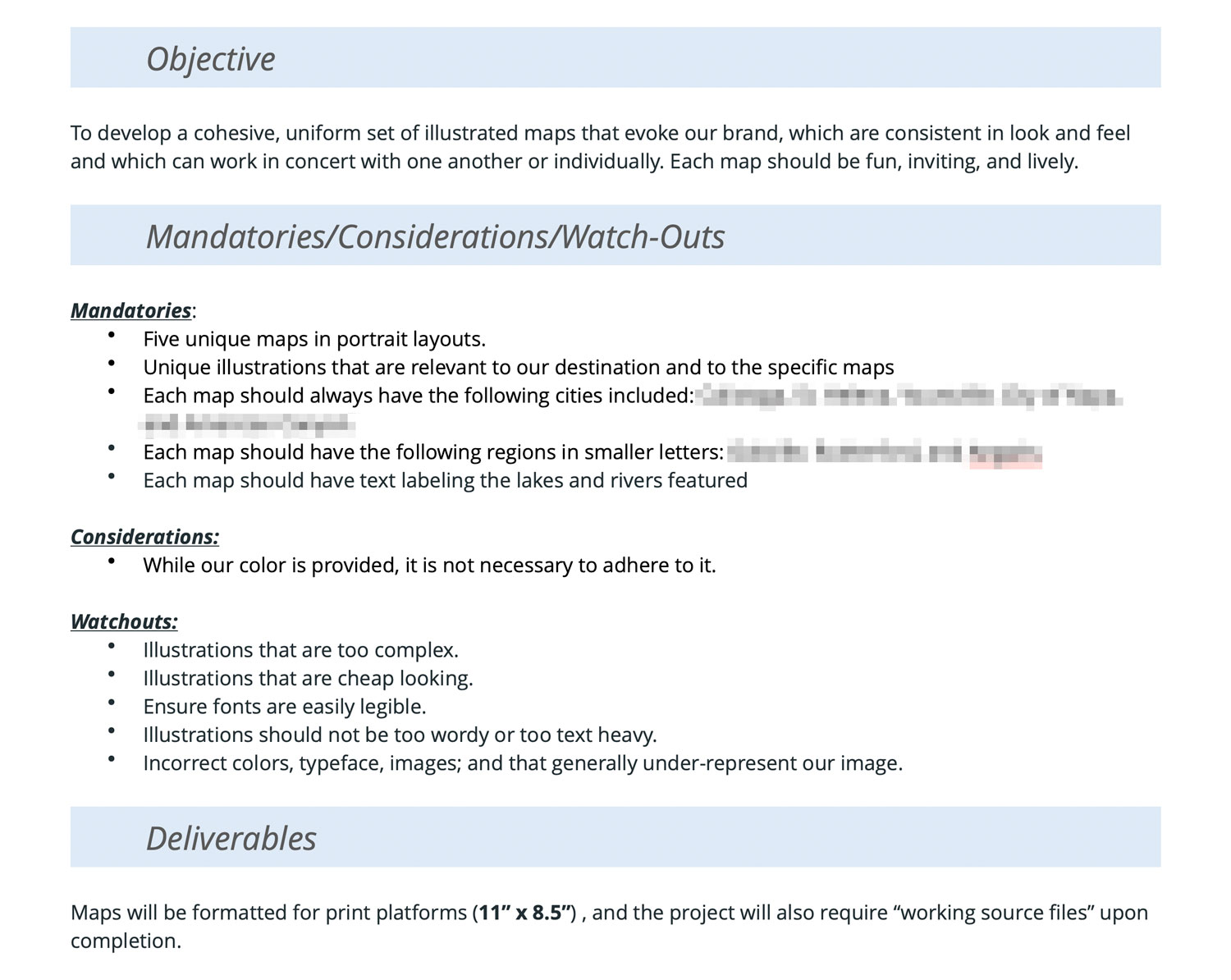
A strong brief should include:
- The goal of the map (orientation, storytelling, promotion of a specific theme…)
- Target audience and what they expect from the destination
- Key attractions and areas to highlight
- Formats and future uses (print, digital, large format, social media)
- Brand guidelines and any existing maps
- What must stay consistent across campaigns or locations
We define many of these elements together. Talking through the priorities helps determine the right style direction, the level of detail, and whether a destination needs one map or an entire set.
Once again, the best maps come from conversations, not just files.
2. What works visually in illustrated tourist maps (and what doesn’t)
Good maps don’t show everything, they show what matters.
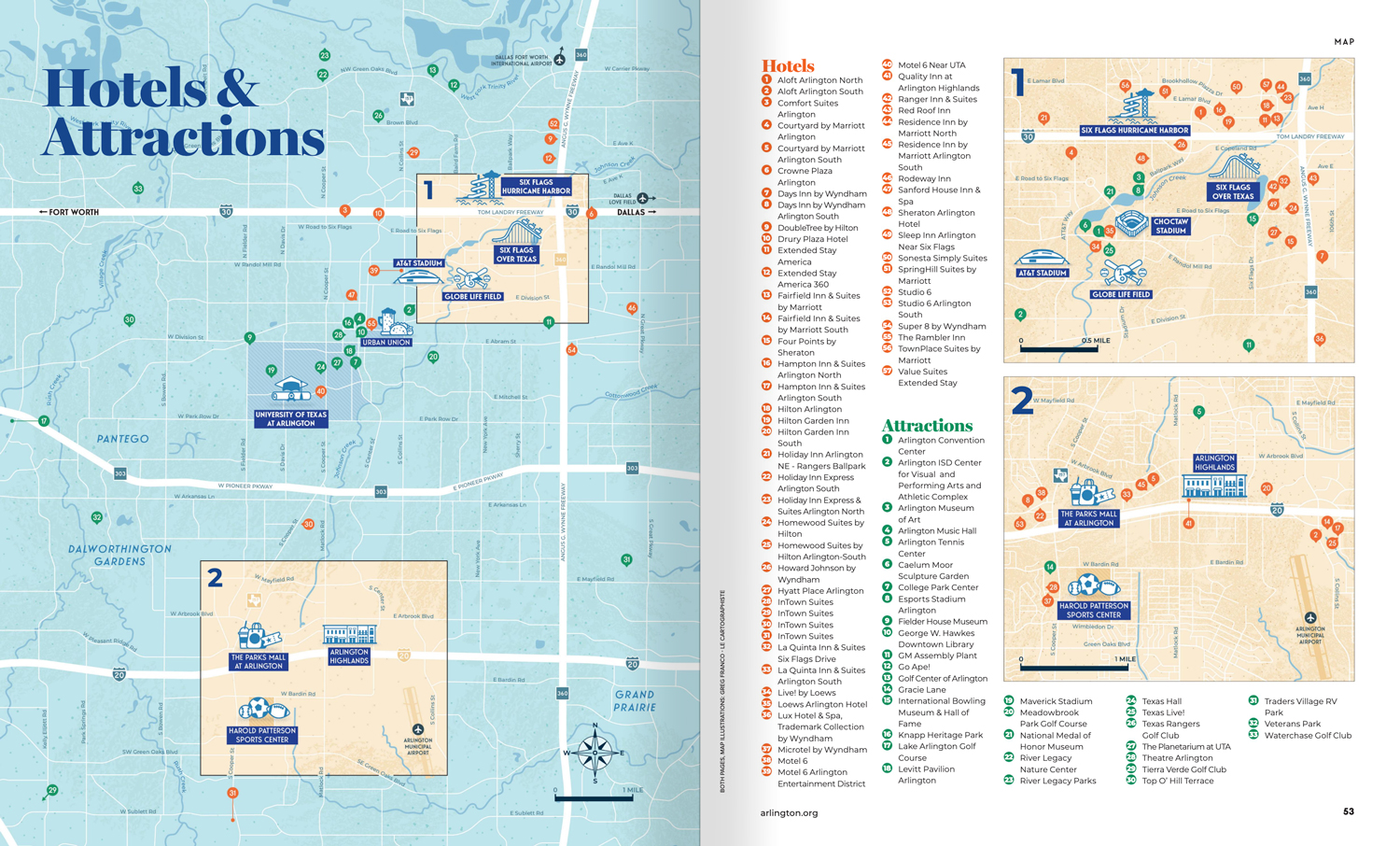
A common challenge for destinations is wanting to include too much. It’s tempting to show everything, because every point of interest feels meaningful. But when everything is highlighted, nothing really stands out.
Here’s what consistently works well in illustrated tourist maps:
- Hierarchy between primary and secondary information
- Clarity and simplified shapes
- Space to breathe (white space is your friend)
- Recognizable landmarks and consistent icons
- Brand alignment through color and illustration style
And when an area includes a lot of points of interest, part of my job is helping my clients make decisions. Sometimes this means creating several themed maps rather than crowding everything into one. Other times, the right solution is to add zoomed-in areas for particularly dense zones. These are small choices, but they make a big difference in how easily visitors can engage with the destination.
3. A Real Example: How Visit Napa Valley Used Illustrated Maps
A map ecosystem that speaks the same visual language.
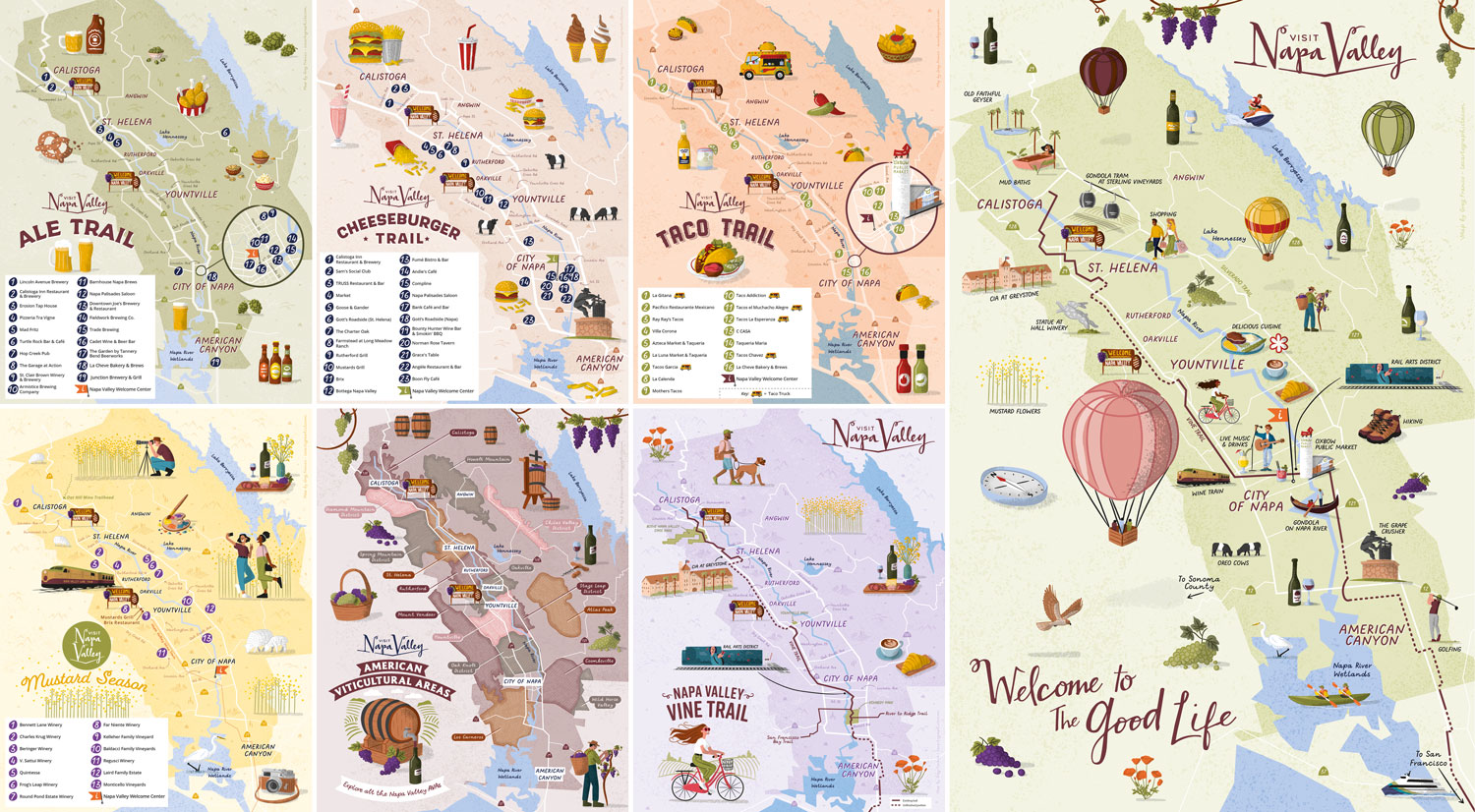
When Visit Napa Valley reached out, they immediately understood that a single map could not carry everything the region wanted to share. Instead, we created a cohesive family of illustrated maps, each with a specific purpose, but all speaking the same visual language.
Here’s how the destination used them:
Food Trails Maps
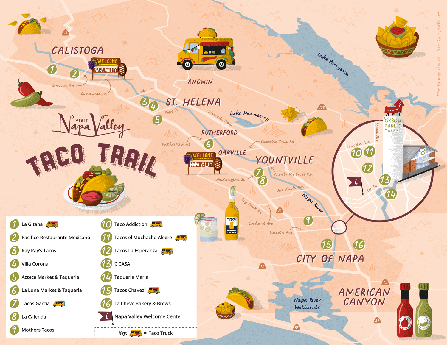
To promote the region’s culinary scene, the destination launched themed food trails dedicated to tacos, cheeseburgers and craft beer. Instead of relying on impersonal Google Maps embeds, we designed warm and playful maps that matched the personality of each theme. Visitors could easily discover local gems and feel invited to explore beyond the traditional wine route.
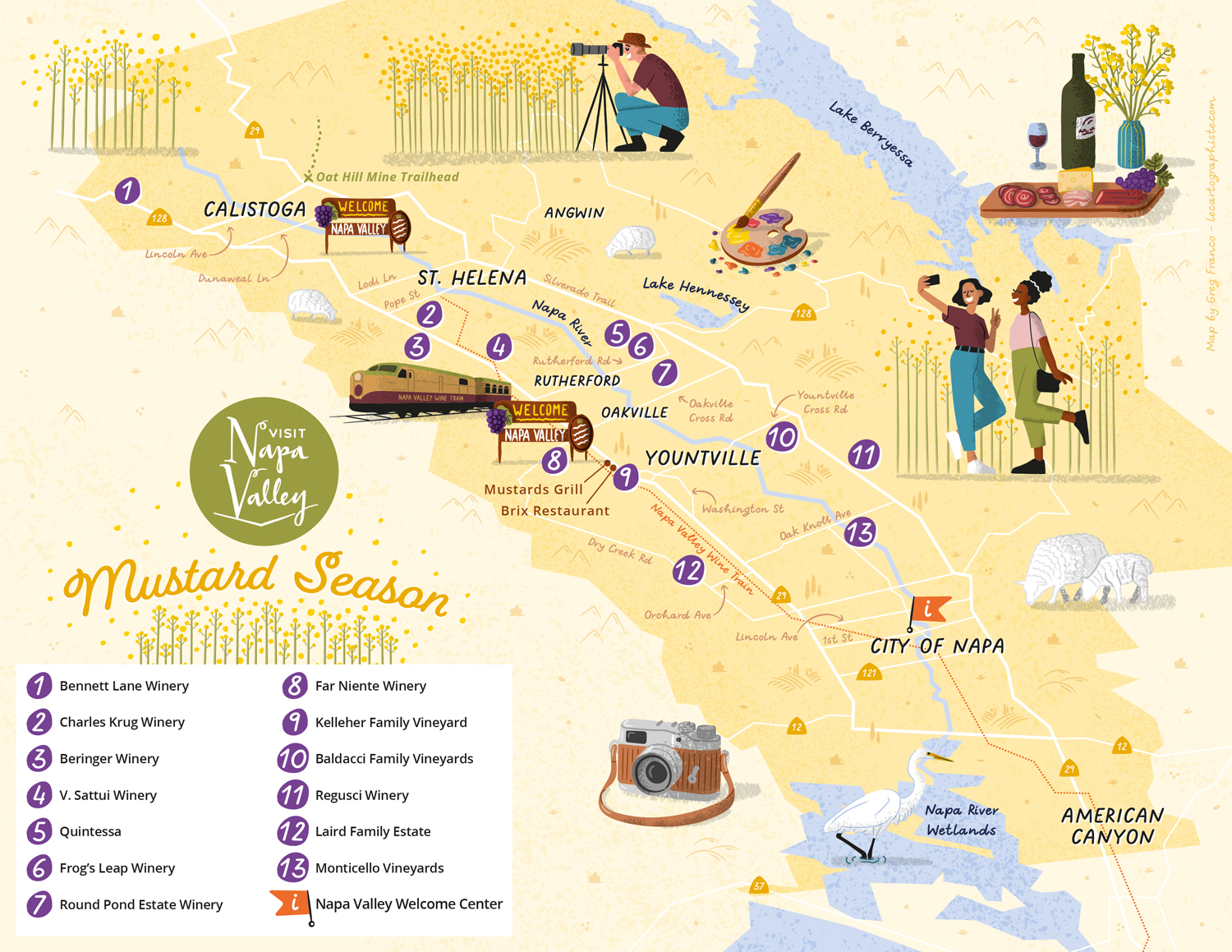
Mustard Season Map
The region also wanted to highlight the vibrant mustard season, a moment when Napa Valley turns bright yellow. We created an illustrated guide showing where to experience the bloom, using a glowing palette and friendly scenes of visitors taking photos among the flowers. The goal was not only to inform visitors, but to convey the joyful, sunny character of the season.
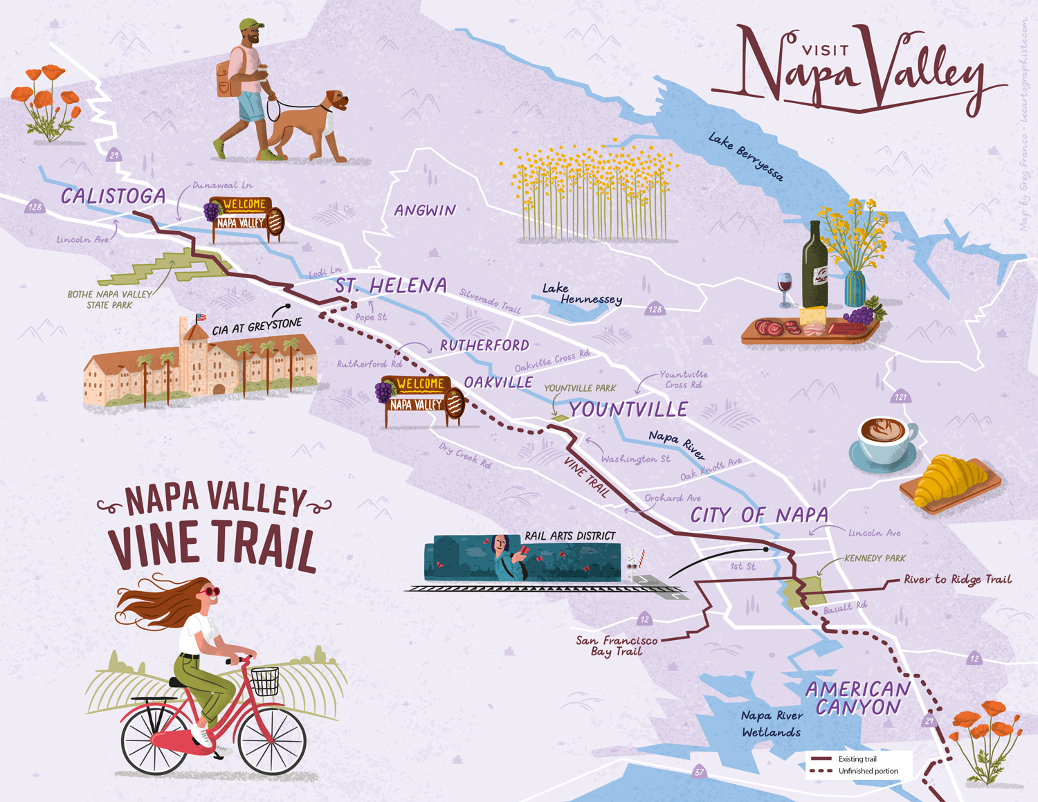
Vine Trail Map
Another key map of the project was the Napa Valley Vine Trail, a 12.5-mile path encouraging visitors to explore the region car-free. The illustrated map shows the route, key stops and the spirit of discovering Napa at a slower pace. Characters, textures and scenery all help visitors picture themselves along the trail.
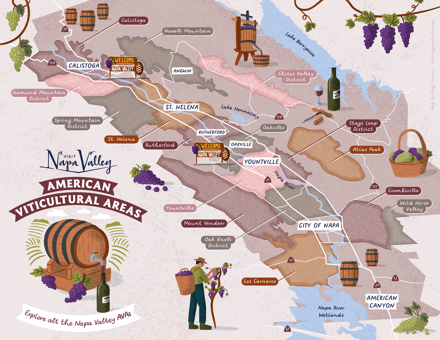
Wine Region (AVA) Map
Of course, Napa Valley is best known for its wine. To explain the 17 American Viticultural Areas, we created a map blending geography with creative storytelling. Illustrations of wine production stages helped make the information more approachable and memorable.
Destination Overview Map
Finally, we created a comprehensive destination overview map gathering landmarks, landscapes, vineyards, food, and experiences: a warm, welcoming invitation aligned with Napa Valley’s “Welcome to the Good Life” identity.
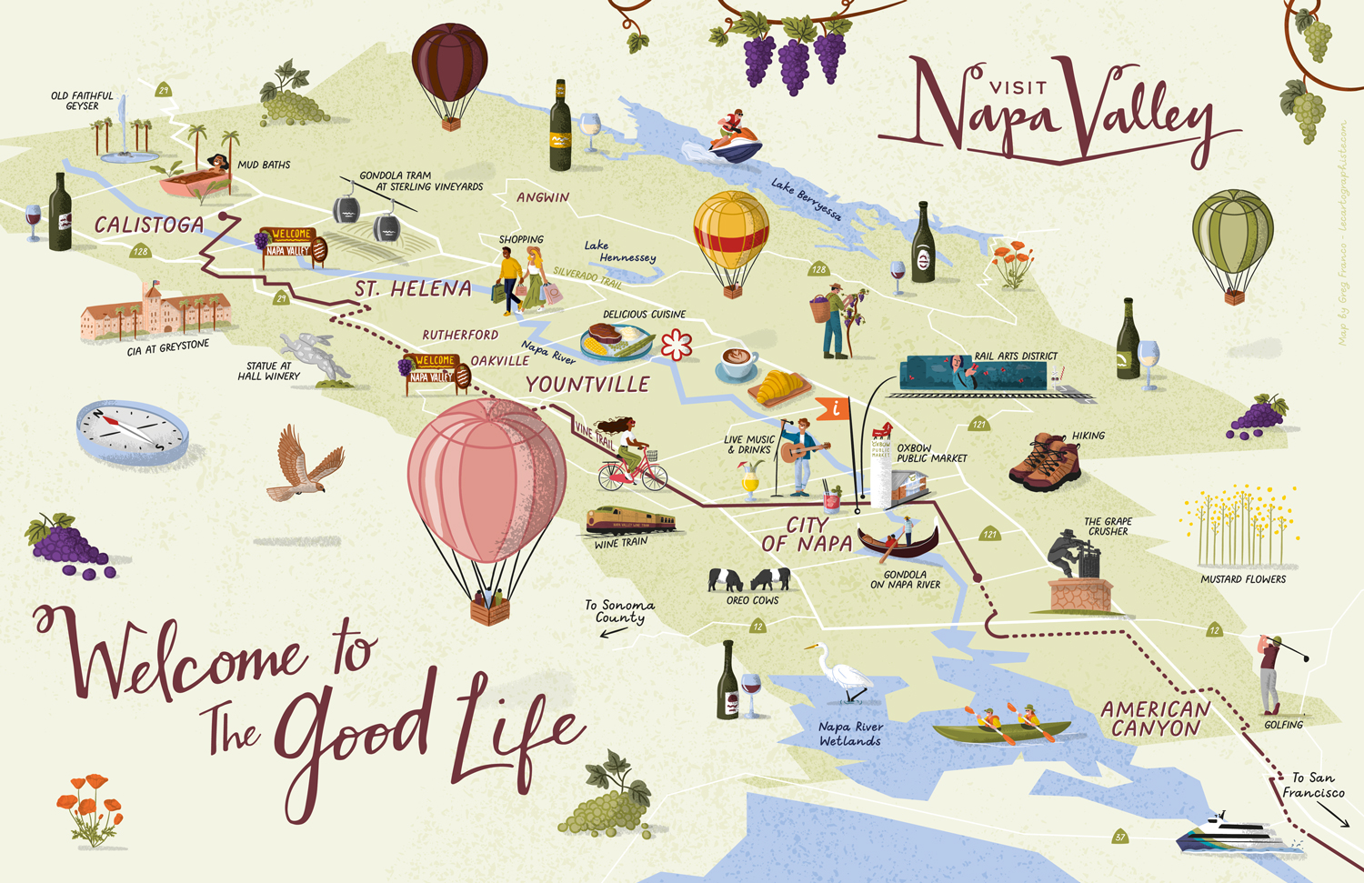
Across all these projects, we used a consistent hand-drawn style, textured illustrations and a whimsical tone. Because these were not navigation maps, I had room to play with scale and composition while keeping geographical relationships clear enough for visitors to orient themselves.
Each map was produced in both vertical and horizontal formats, and all the illustrations — more than eighty — were designed to be reused individually throughout the destination’s marketing tools. In the end, Visit Napa Valley didn’t just receive maps; they received a cohesive visual toolkit supporting their storytelling across multiple channels.
4. Practical Tips for Tourism Boards Before Starting a Map Project
Think in terms of visitor experience, not just geography.
When destinations begin thinking about a map, the most helpful starting point is the visitor experience. If you’re considering starting a map project, here are a few insights that make the process smoother and the result stronger:
- Choose a style aligned with your destination’s identity. A map works best when its style matches the experience you want visitors to have.
- Prioritize clarity over completeness. A successful map feels simple, even when the place isn’t.
- Define what is essential vs. optional. This avoids overcrowding and ensures the map remains usable. Think “must include” vs “nice-to-have”.
- Prepare assets early (logos, guidelines, icons…). It ensures that the map aligns perfectly with the rest of the communication tools.
- Anticipate future reuse. Repurposable illustrations save time and help maintain brand consistency.
- Give the project enough time. Realistic timelines make collaboration smoother. I explain this in more detail in my article on what to expect when working with a map illustrator.
- Avoid generic solutions. Many destinations rely on their website and embedded Google Maps to show points of interest. These tools are functional, but they feel impersonal and inconsistent with the rest of their branding. Custom illustrated maps create a cohesive visitor experience across all communication tools and create a stronger emotional connection with visitors..
5. Conclusion
Illustrated maps are powerful communication tools for tourism boards, DMOs and CVBs. They help destinations communicate clearly, share their identity, and inspire both new and returning visitors.
If you’re considering commissioning a map, whether it’s a practical overview, a themed trail, a wine region map or a full family of illustrated maps, I’d be happy to collaborate. Let’s bring your destination’s story to life together.
To learn more about me, visit my About page and if you want to see more of my work, you can browse my portfolio. You can also follow me on Instagram for recent work and updates.
Greg Franco

